Demure
- Description
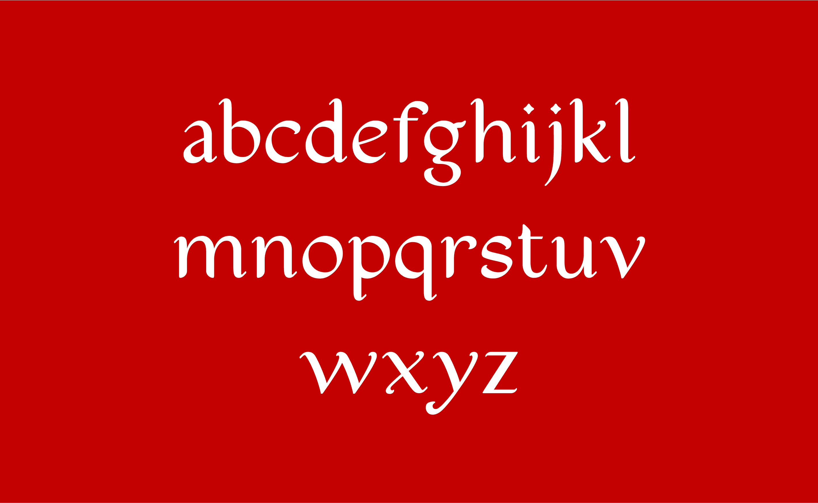
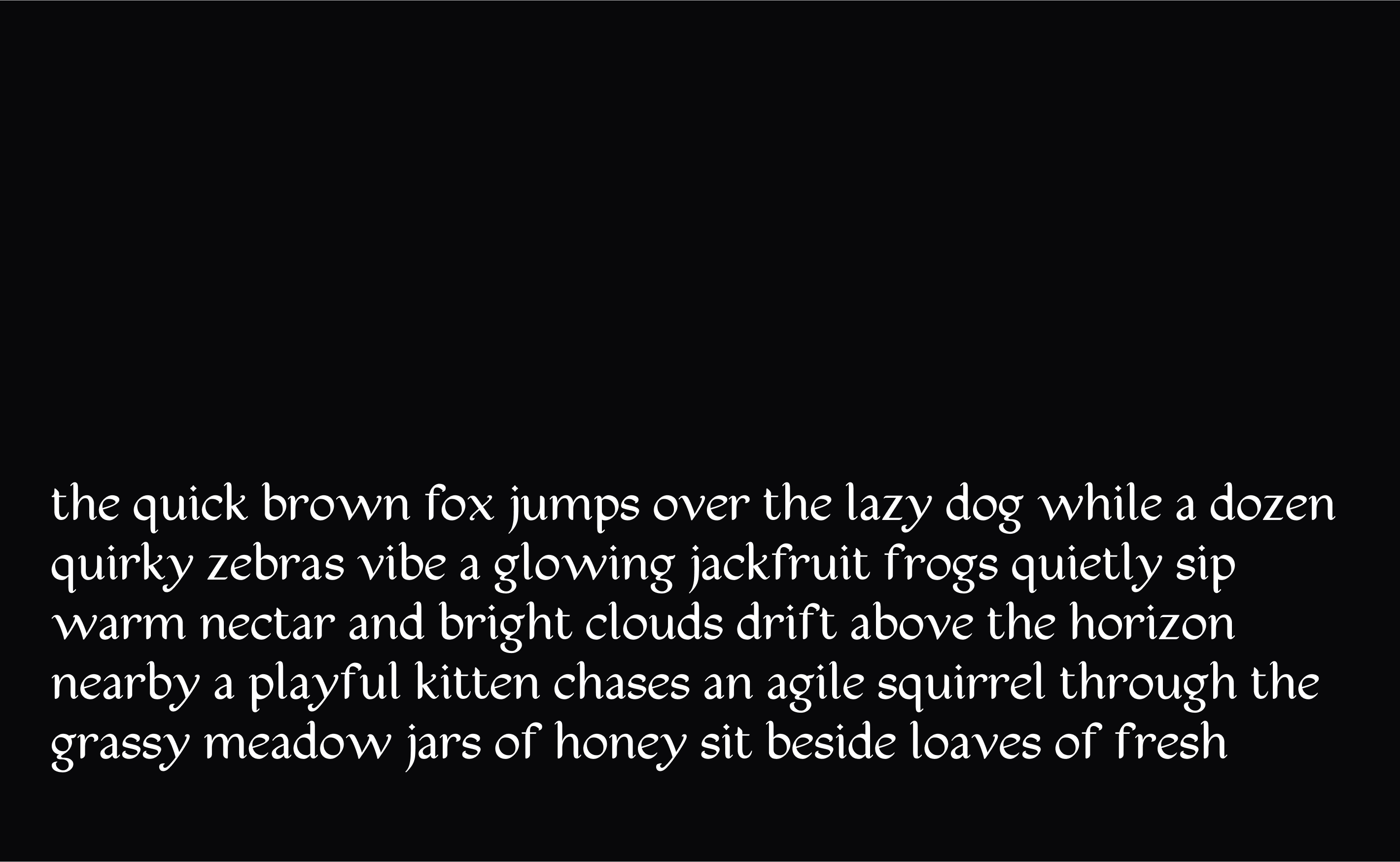
Demure is a calligraphic display typeface developed over six weeks during Practica Program’s Latin One course, under the guidance of type designers Nicole Dotin and Sol Matas.
- Field
- Typeface Design
- Role
- Type Designer
- Client
- Self-initiated, developed through Practica Program
- Year
- 2024
Demure began at Practica, where I learned type design from the pen up. I started with calligraphy on paper, studying contrast, rhythm, and stroke construction before moving into Glyphs. A typography book I had owned since I was thirteen became a working reference throughout the project.
The lowercase was built from o and n, which established the proportions, spacing, and movement for the rest of the alphabet. Each character was drawn repeatedly in ink, selected, and rebuilt digitally, keeping the pressure and direction of the pen visible in the final forms.
The result is a display typeface that sits between serif and script. Its structure is restrained, while the calligraphic contrast and expressive details give it a distinct voice at larger sizes.