Wellim

Description

A complete identity for a hospitality brand matching travellers to places by feel.

Most travel platforms rank hotels by luxury and let you choose from the top. Wellim starts elsewhere: every place has a character, and one of them fits you. My role was to make that match visible before booking.

Field
Branding · Illustration · Motion Design
Client
Wellim
Year
2024

Alignment as the identity

The identity is built around alignment. The eclipse became the central device, with separate forms meeting to create one complete symbol. This idea carries through the logo, motion, and illustrations.

Wellim eclipse symbol on a dark background
Wellim wordmark on a warm white background

Atmosphere over ornament

Instead of signalling luxury through ornament, the visual language focuses on atmosphere. Warm light, restrained compositions, and considered movement allow each property to express its character while still belonging to Wellim.

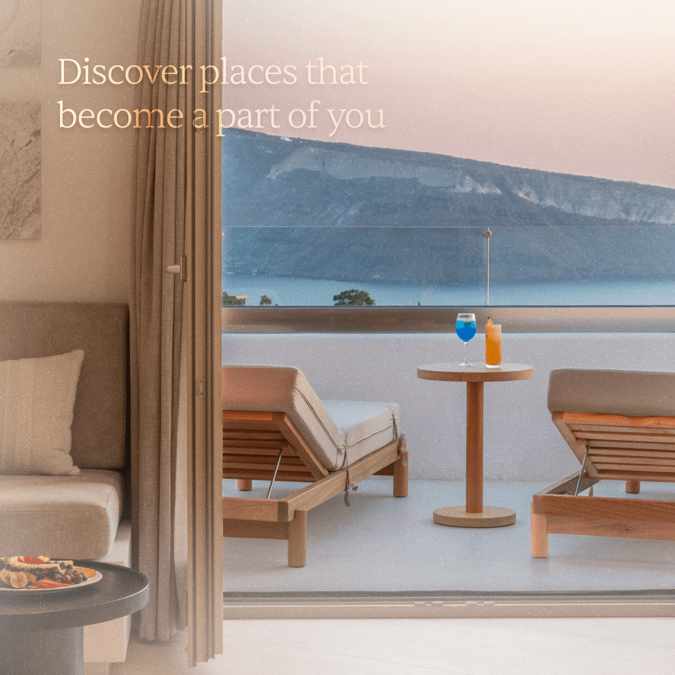
Wellim hotel suite overlooking the sea
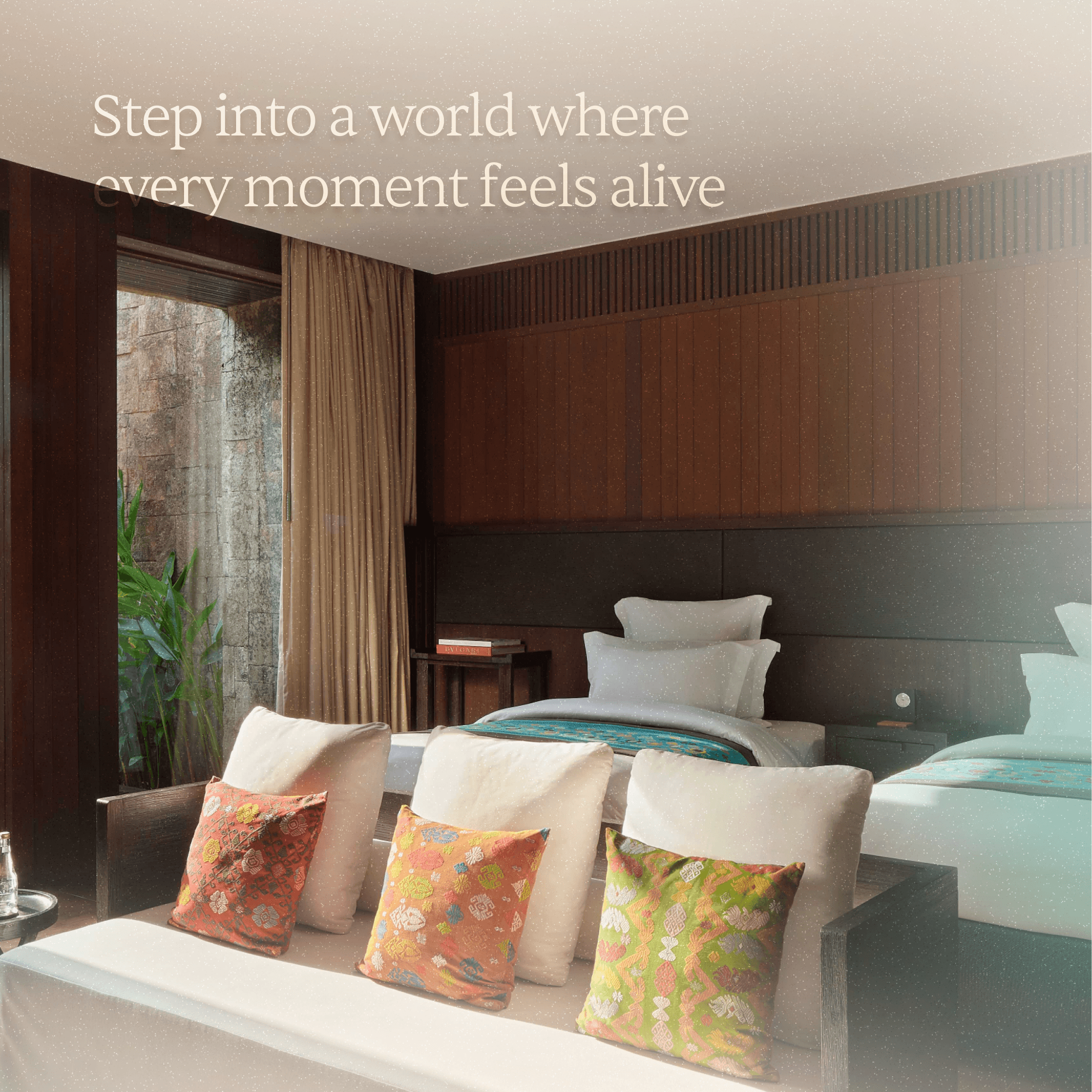
Wellim hotel room opening onto a tropical garden
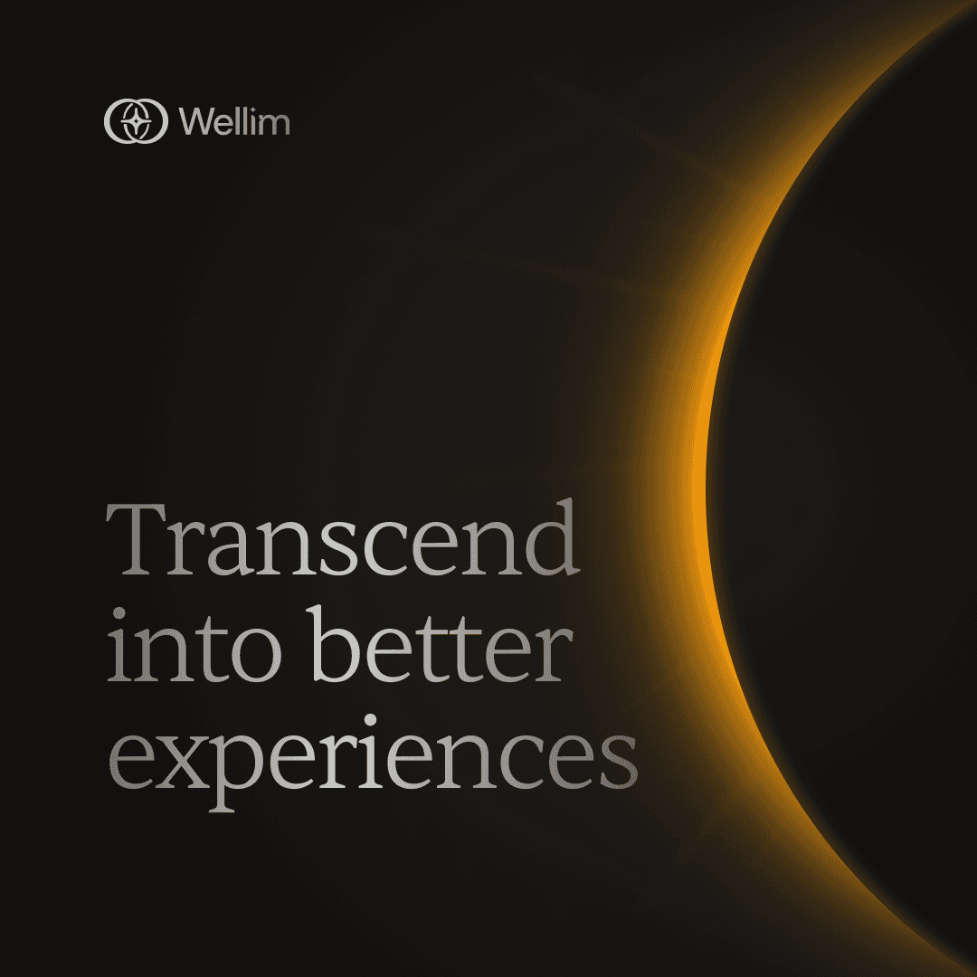
Wellim brand promise: Transcend into better experiences
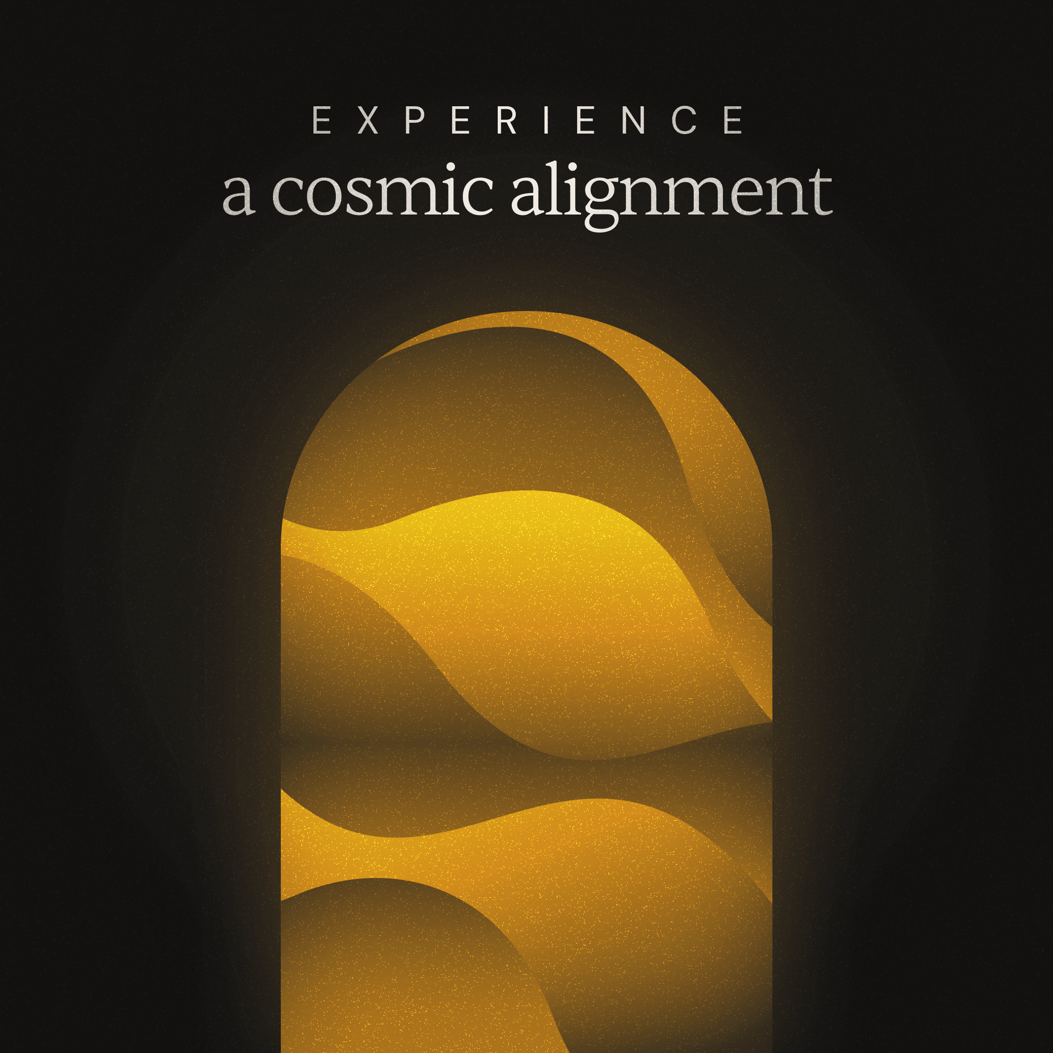
Wellim illustration system for hospitality experiences

Choosing a place by feel

The system helps travellers understand a hotel through how it feels, not simply where it ranks.

Wellim password reset email design
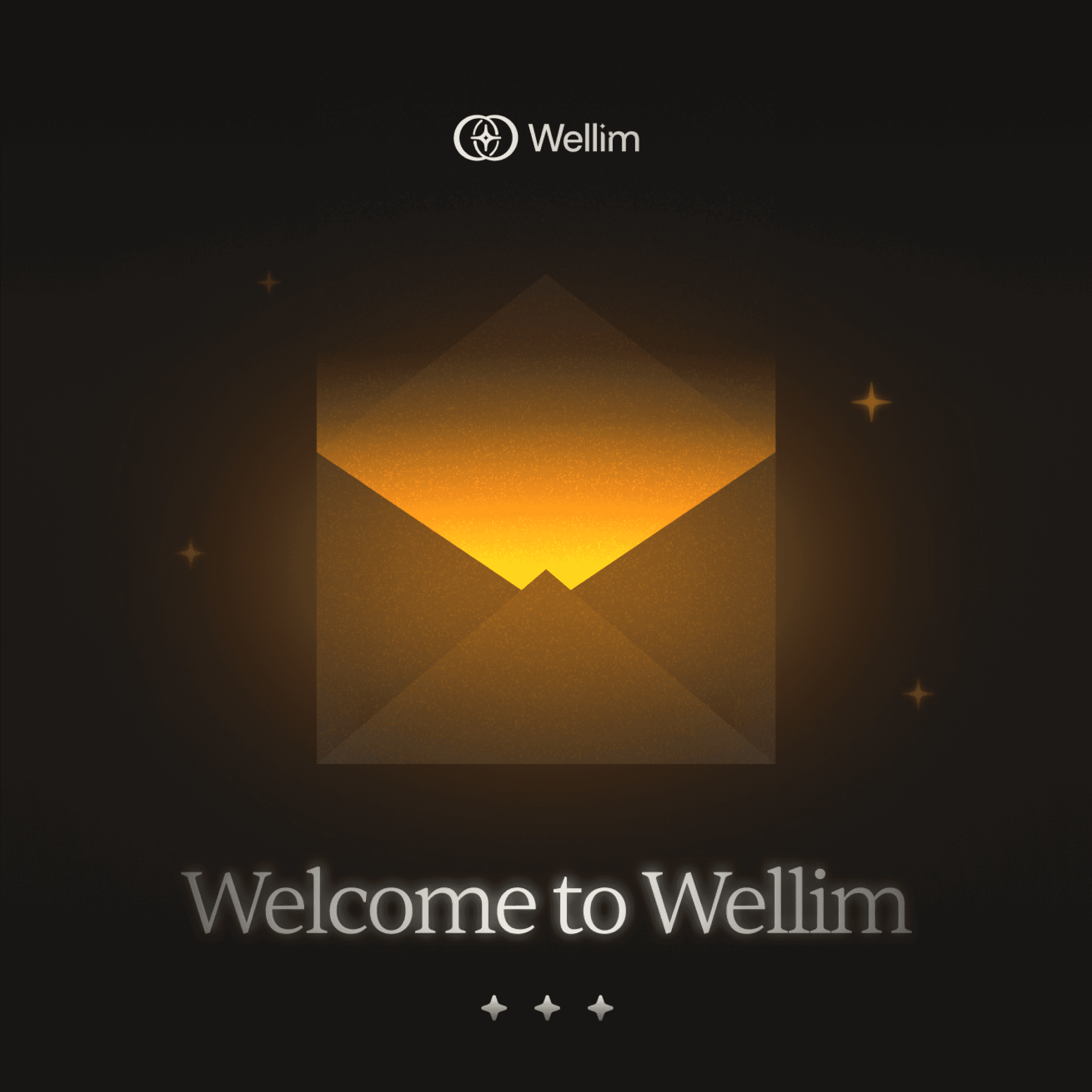
Wellim welcome email design
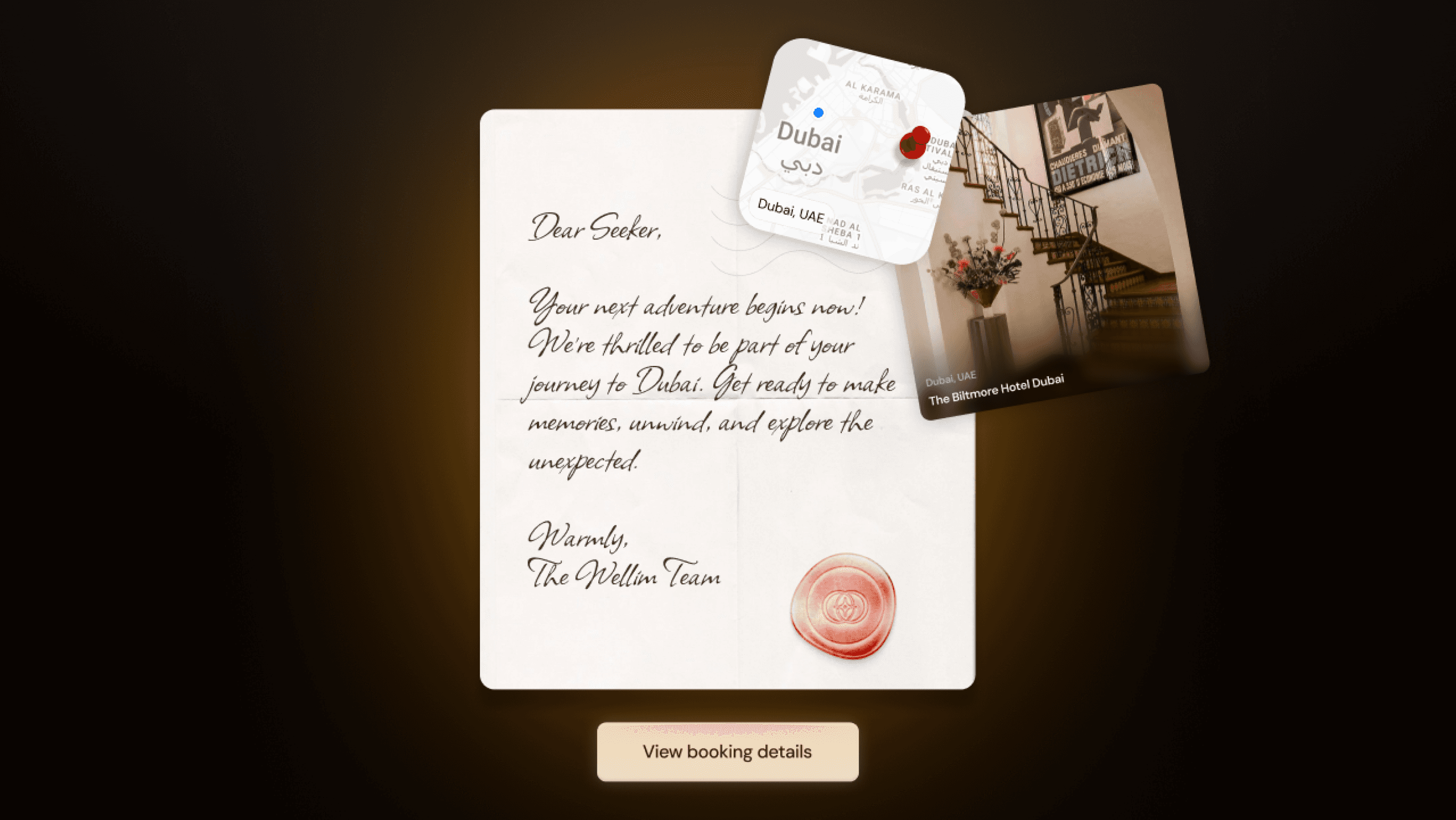
Wellim booking confirmation letter and destination card